I am pleased to present the series Luminotype conducted in June 2025. This series has a particular specificity. In the following paragraphs, I further develop the choice of a transparent painting medium.
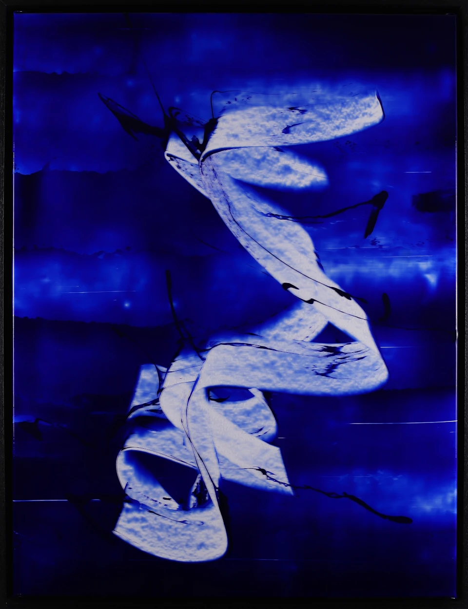
Luminotype I – acrylic, PVC, paper – 2025 – 80×60 cm – © Adagp
The peculiarity of the series Luminotype is the choice of medium to paint. Traditionally, we paint on canvases of cotton or linen, on paper or on wood. I had the opportunity to experiment with all these materials and appreciate their respective qualities.
Fabrics & paper____
The fabrics, for example, reveal in the final canvas the weaving weft. The canvas has a grain that gives the paint a very pleasant physical and tactile presence. We want to touch the support. Also a detail that is not one, a very thin frame sffaced in the final rendering while a coarser frame will probably be perceived by the spectator.
Paper also has a wide variety of textures and grains because of its wide variety of manufacturing and raw materials. The paper medium also invites touch or interaction with its surface. There is an infinity of papers from the most artisanal to the 90g/m2 industrial paper ramette that everyone knows.
However, with my use, a common point brings together all these media: their relative opacity. This feature is particularly found in the dark tones. Appears as a phenomenon that "closes" the surface, which makes it denser, harder. It is precisely this opacity that led me to explore other ways.
A more dynamic subjectile___
So logical thinking is how to find a support that is more versatile? My attention has focused on a more dynamic subjectile, capable of interacting differently with light and color. Of course, this reflection was directed towards transparent materials, and in particular towards transparent canvas. This represents the advantage of being able to be stretched on a chassis, like a traditional canvas. The final paint retains a volume presence that I find interesting and even almost necessary.
The first obvious observation is that one is on a bright surface, it is certainly a hell to be taken in pictures but there are new advantages: in particular with the way the light circulates through the surface: it crosses it, reflects on it, diffuses it. The association with acrylic paint, which also has translucent properties, creates colorful vibrations of great richness, especially with the blue pigments overseas.
In the series Luminotype, I work in monoton, i.e. starting from a given color: here the overseas blue. I start with this color in its highest concentration and then work around this tone producing a partial gradient, a range of shades that spreads around the selected shade.
In any case, by showing the result to colleagues, the rendering was appreciated.
As a conclusion and to broaden the subject a little, I felt that this technique opens a lot of doors. I've got plenty of ideas for the future. So to follow...