Artist's workshop

  • A unique pigment: the overseas blue, series « Luminotype »

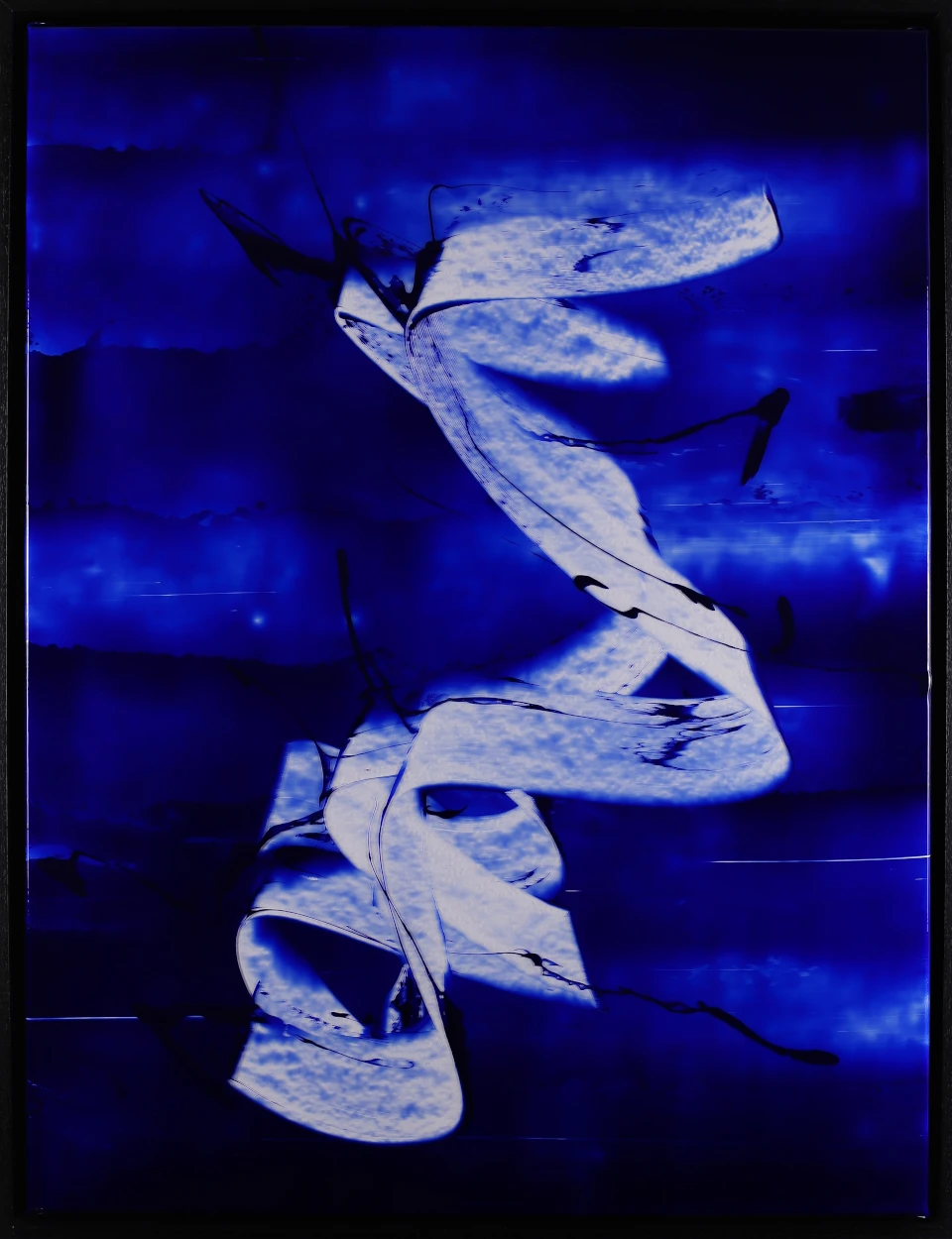
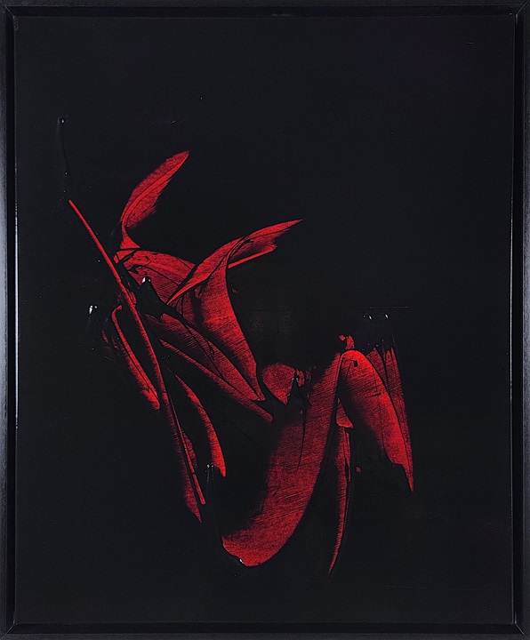
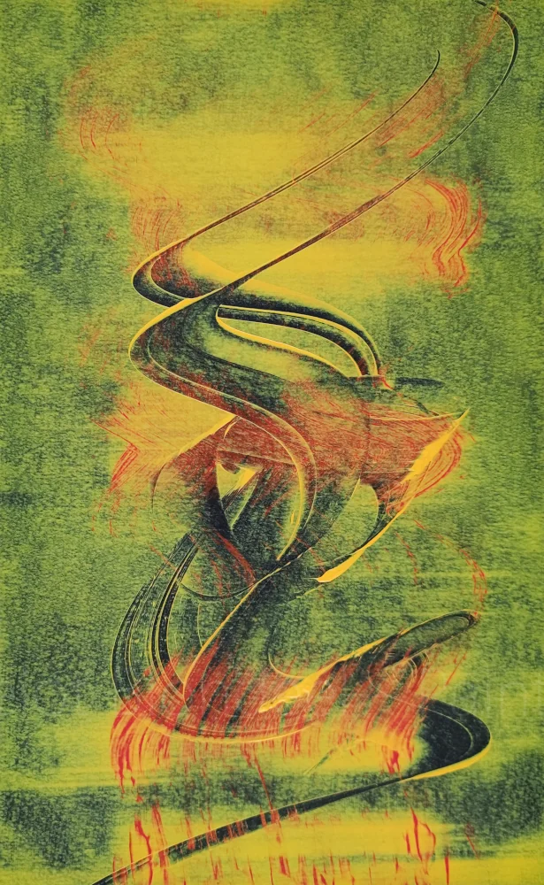
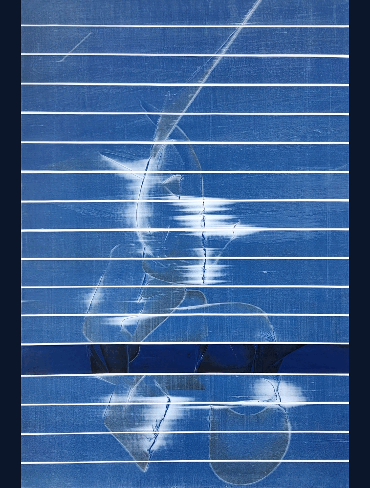
    All paintings in the series Luminotype share as a starting point a unique color: overseas blue. I suggest you see how and why this particular color holds a central place in the series.

    A force, a depth

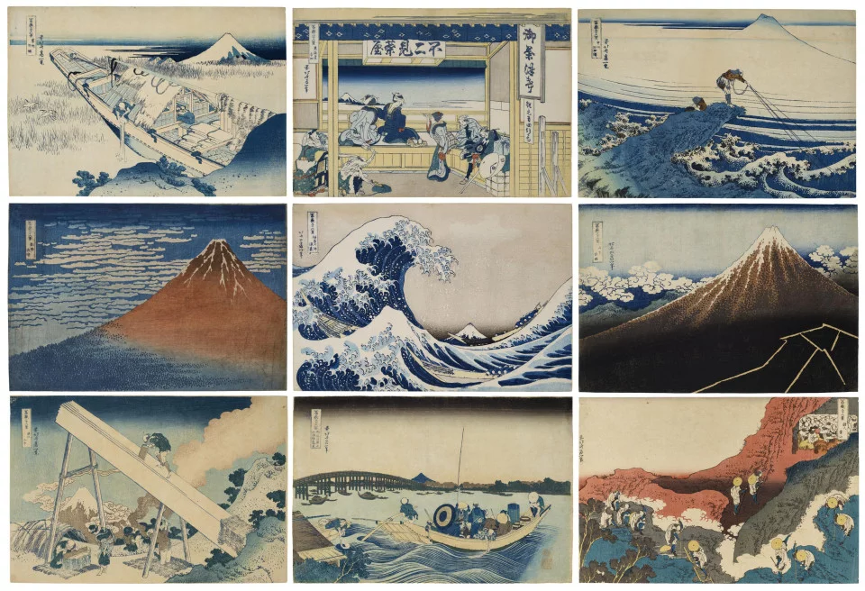
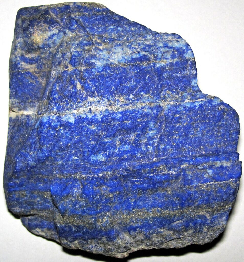
    I chose the overseas blue not only for the color itself, but keeping in mind the history of the pigment that is intimately associated with it: lapis-lazuli. I am far from being the first fascinated by this color; pigment has been used in the East and West for millennia. I find him a strength, a depth that I find in no other color. The word iridescent seems to me the most appropriate. You feel in this term something that comes out of the light. It is not at all a coincidence that overseas blue has been repeatedly used in Christian religious scenes.

    I also learned the etymology of the term lapis-lazuli: the name derives from Latin lapis, which means stone, and of lazuli, which means azure and which itself comes from Persian lâdjaward, himself of Sanskrit raja varta, which means king's portion (raja : King, varta : portion). In a way, you hold in your hands a fragment of royalty. I find it quite touching to be linked to a term that emerged on the other side of the planet.

    Under microscope, x240

    Lapis-lazuli, a semi-precious stone

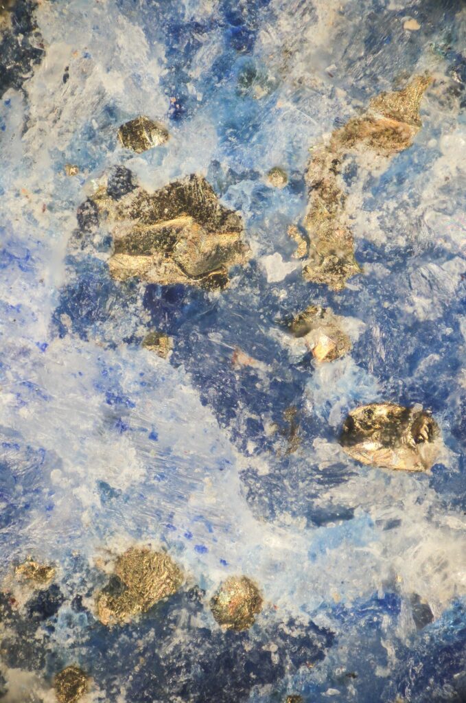
    But let's go back to our pigment. So we are dealing with a semi-precious stone which, reduced to extremely fine powder and then decanted many times, will produce an exceptional color. In addition to its unique colour, lapis-lazuli had another characteristic that made it so special: it was only extracted from one place on earth, in present-day Afghanistan. This makes that in the West, from the Middle Ages to the 19th century, it was an extremely expensive material that sometimes approached or exceeded the price of gold.

    One imagines that in painting its use has been particularly measured. It even seems to me that during the Renaissance, during the orders, the precise quantity of stone was noted in the contracts between the artists and their patrons. Until the day when, by serendipity, a French chemist found in 1814 a way to artificially synthesize it. Since then, we can use it in unreasonable quantities, which obviously makes it easier — even more when making an entire series with this color. If you're curious, I invite you to discover the many uses of stone in art, jewellery, everywhere: it's quite impressive. I will not mention the list of artists who worked with this color before me — There are far too many of them.

    A certain vision of infinity

    Instead, I will highlight the direction I have directed myself towards: the color space between the overseas blue and the black, which I find most fascinating. There is simply a depth, like a certain vision of infinity. It's kind of like, beyond that color, another world was possible. It is a diffuse feeling, rather difficult to describe — I pass it on to you as I feel it.

    And what do you think of this color?

    Video

  • Why work in series, « Luminotype »

    Thirty-six views of Mount Fuji, overview

    It is said that one of the first artists to have worked in series would be Claude Monet with his famous series on nympheas. In any case, I found this statement at an exhibition in Giverny, dedicated to Monet and Rothko. I think, however, that a number of counter-examples can be found; I am thinking, for example, of 36 views of Mount Fuji by Hokusai. It's a little curious as a statement, knowing that Monet was himself quite admirer of Hokusai — but not just from him —, Japanese prints in general. Besides, when visiting his home in Giverny, there are many examples.

    Why do artists work in series?

    In general, it is to be interested in a given subject, a given problem. At Monet, the subject is nympheas; At Hokusai, it's Mount Fuji. I am no exception to this rule: for my part, it is the study of a new material.

    The series, therefore, is a collection of works crossed by the same subject. It's exactly the same in music: We call it an album. In an album, you can feel that there is a common unit to all tracks, something that brings them together. This indicates an important character of the series: the concept of coherence. All works in a series are consistent with each other, in any case from an aesthetic point of view.

    Selection

    Moreover, when I constituted the series LuminotypeI put away the paintings that were too far away from that unit that I had in mind. Sometimes the concern lay in the outcome of the work in question. It may also be that the canvas in question was too different and was worth its own series. — in the sense that its singularity could constitute a series in its own right.

    I like this notion of series because it gives a framework, allows to target a given question, and requires to create an aesthetic at the service of our object of study. This leads to a formal reflection on how to design, assemble and articulate the elements that form our series.

    I told you here about the vision of the creator, of the artist. On the viewer's side, consistency should be imposed on itself: the series, in order to exist fully, must be perceptible as such without any need to explain it.

    The constraint is fertile

    In any case, it is certain that the constraint in which we place ourselves is a motor of creativity. The constraint is fertile. Somehow, it is the tightening that opens. To reformulate, I will ask the following question: by respecting the constraints imposed on us, how can we invent, decline, enlighten, nourish, deepen our subject and bring it the necessary light?

    Video

  • The painting gesture, series « Luminotype »

    Luminotype III - acrylic, PVC, paper - 2025 - 80x60 cm - © Adagp

    Luminotype III – acrylic, PVC, paper – 2025 – 80×60 cm – © Adagp

    Making a canvas without premeditation__

    I wanted to address here the signical aspect of my practice. I started this work during the production of the series No Reason. This rather curious title illustrates the following point: there is in art a certain injunction to justify his gesture. I just named the series No Reason to come in counterfoot and naively claim a certain spontaneity and realize a canvas without premeditation, without reflection.

    Time passes, I keep working, the result starts to please me. I prefer simple means: monochrome or bichrome tones and a raclette-centered realization or more precisely on the form obtained. I end up trying to complexify the effects of texture, background, I perform a number of tests, successful and less successful until I realize that in the final result it is the form obtained that interests me.

    Affirm an aesthetic___

    This is where I will contradict what I said at the beginning: I will seek to understand my intention but above all to assert an aesthetic. Which means I'm going to be like setting out the expected criteria. I take this on the positive side, I see it as a certain maturity of the practice of gesture. I can say that the gesture to trace my shapes, I executed it thousands of times.

    By force, we touch with a finger what works and what works less. What had started spontaneously, without premeditation, becomes a gesture achieved in any case subjectively is the feeling that I have. We understand how wheelbases, projections, line thickness, background dialogue, color selection etc. work. As I said, we end up understanding what works and what works less. Finally the realization becomes premeditated, thought, thought. On the other hand, the gesture keeps him spontaneity, I never know what will come out.

    One obviously thinks of the body: I ask myself the following questions: how to place oneself to perform the gesture, with what angle, what supports, etc.? In these phases, by doing, doing and doing it again becomes like almost a body to body between the canvas and yourself. Believe me, that's really the feeling I have. Obviously in reality, it is rather a duel between oneself and oneself.

    On the canvas persists a memory of the gesture___

    I used to say "on the web comes to persist a memory of the gesture". One additional aspect I wish to address concerns the temporal aspect. While the gesture is made in a handful of seconds, the canvas benefits from a real relative permanence. This is where the notion of a "memory of gesture" becomes very important.

    Video

  • Paint on transparent support, series « Luminotype »

    I am pleased to present the series Luminotype conducted in June 2025. This series has a particular specificity. In the following paragraphs, I further develop the choice of a transparent painting medium.

    Luminotype I - acrylic, PVC, paper - 2025 - 80x60 cm - © Adagp

    Luminotype I – acrylic, PVC, paper – 2025 – 80×60 cm – © Adagp

    The peculiarity of the series Luminotype is the choice of medium to paint. Traditionally, we paint on canvases of cotton or linen, on paper or on wood. I had the opportunity to experiment with all these materials and appreciate their respective qualities.

    Fabrics & paper____

    The fabrics, for example, reveal in the final canvas the weaving weft. The canvas has a grain that gives the paint a very pleasant physical and tactile presence. We want to touch the support. Also a detail that is not one, a very thin frame sffaced in the final rendering while a coarser frame will probably be perceived by the spectator.

    Paper also has a wide variety of textures and grains because of its wide variety of manufacturing and raw materials. The paper medium also invites touch or interaction with its surface. There is an infinity of papers from the most artisanal to the 90g/m2 industrial paper ramette that everyone knows.

    However, with my use, a common point brings together all these media: their relative opacity. This feature is particularly found in the dark tones. Appears as a phenomenon that "closes" the surface, which makes it denser, harder. It is precisely this opacity that led me to explore other ways.

    A more dynamic subjectile___

    So logical thinking is how to find a support that is more versatile? My attention has focused on a more dynamic subjectile, capable of interacting differently with light and color. Of course, this reflection was directed towards transparent materials, and in particular towards transparent canvas. This represents the advantage of being able to be stretched on a chassis, like a traditional canvas. The final paint retains a volume presence that I find interesting and even almost necessary.

    The first obvious observation is that one is on a bright surface, it is certainly a hell to be taken in pictures but there are new advantages: in particular with the way the light circulates through the surface: it crosses it, reflects on it, diffuses it. The association with acrylic paint, which also has translucent properties, creates colorful vibrations of great richness, especially with the blue pigments overseas.

    In the series Luminotype, I work in monoton, i.e. starting from a given color: here the overseas blue. I start with this color in its highest concentration and then work around this tone producing a partial gradient, a range of shades that spreads around the selected shade.

    In any case, by showing the result to colleagues, the rendering was appreciated.

    As a conclusion and to broaden the subject a little, I felt that this technique opens a lot of doors. I've got plenty of ideas for the future. So to follow...

    Video

  • National Days of Artists (JNA) – Open Doors

    National Artists Days - Atelier Lancelot Blondeel - Fontenay-sous-Bois

    I am pleased to welcome you to this first edition of the JNA. At this event, I will present my creative process, the tools, the intellectual path leading to a series and the works produced.

    The workshop will be open on Saturday 13 September from 10am to 6pm.

  • Four exhibitions this May

    Four exhibition venues May 2025 - Halle Roublot - Fontenay sous bois, La Fonderie - Fontenay sous bois

    This weekend is very special, indeed for the first time, my paintings will be visible in four different places in the Paris region.

    I will be present at the Roublot Hall in Fontenay-sous-Bois as part of « Come in it's open. » This weekend of May 17/18. J « temporary workshop » and I take this opportunity to present my work tools. I will present six works of medium to large format. I will also be at the opening tonight from 6:30 p.m.

    The second place where I expose is the Foundry in Fontenay-sous-Bois. La Fonderie is a former factory converted to artist residence. The place is particularly pleasant, you can visit the residents' workshops this weekend also as part of the « Come in it's open. » (17/18 May).

    I am also pleased to announce the extension until June of my exhibition in a real estate agency rue de Verneuil in Paris. Open from Monday to Friday and located right next to the Musée d'Orsay, it displays nine canvases of the series « No Reason » and « Landscapes Interlaced ».

    Finally, as part of the Sévrienne des Arts, I present a painting « Landscape Interlaced » To Sèvres. The exhibition is open from 16 to 25 May.

  • Invitation opening Friday 16 May & residence to visit

    No Reason XXIX - acrylic on canvas - 2025 - 80x65 cm - © Adagp

    I am pleased to invite you to the opening of my exhibition at Halle Roublot on Friday 16 May at 6.30 p.m. (95 Rue Roublot – 94120 Fontenay-sous-Bois).

    This event – open doors to workshops – takes place on the weekend of 17/18 May from 11am to 8pm. I'll be at the lobby on Saturday and Sunday.

    I will present several works of small and large formats within a « temporary workshop ». I will take this opportunity to present my work tools and practice to the public.

    Being also a member of the association / residence La Fonderie always in Fontenay-sous-bois. I will also exhibit a painting. This residence has an important place in the local creative and cultural landscape. Don't hesitate to visit the same weekend, you will find many quality workshops.

    Looking forward to meeting you on Friday.

    Halle Roublot in preparation for Enter is open 2025 - Fontenay under wood
  • Two exhibitions in May, new series & interview

    I am pleased to announce my next two exhibitions this May.

    In an ephemeral workshop, I will exhibit at Halle Roublot in Fontenay-sous-Bois several canvases of small and large formats. This exhibition will take place as part of the « Come in it's open. ». This city-wide event opens the doors of artists' workshops and welcomes the public to these usually closed places.

    The event takes place on the weekend of Saturday 17 and Sunday 18 May from 11am to 8pm. I will be present at the opening on Friday 16 May at 6.30 pm at Halle Roublot (95 Rue Roublot, 94120 Fontenay-sous-Bois). The exhibition sale of the Halle will remain open until 13 June.

    I also have the pleasure of exhibiting at Sèvres from Friday 16 May to Sunday 25 May 2025. The opening this time will take place on Saturday 17 May from 5pm at SEL (47 Grande Rue, 92310 Sèvres). The selection of artists consists of works around the theme: « Air ».

    You will find a selection related to this theme by following the following link: https://www.sevriennedesarts.com/art lounge/

    Solar Wind X – 2024 - Acrylic on paper – 39×25 cm – © Adagp

    Solar wind X – acrylic on paper – 50×30 cm – 2024

    On the workshop side, I opened my practice to a medium one can no longer traditional: paper. On this occasion, I worked painting on small formats. Often inspired by scientific subjects, I have named this series of works: « Solar wind », with reference to the flow of charged particles through our solar system...

    Finally, as part of my residence at Pre-lifeWe came to interview about my workshop practice. I took this opportunity to present my gesture approach.

    Looking forward to meeting you this May.

  • New year

    I take this new year to wish you my best. I wish you that it is filled with curiosity, openness, discoveries, but above all tolerance... The world presents itself to us as a face of ever-renewed complexity. Even if this sometimes seems easier, let us avoid excessive simplification; We'll only get out richer...

    From a practical point of view, I am pleased to announce my new workshop at Préàvie, Pré-Saint-Gervais (near Paris). This place hosts about 50 artists and artisans. I hope to exchange with my peers, learn new techniques or even question some of my ideas. Below is a short presentation video.

  • Exhibition rue de Verneuil

    I am pleased to confirm the information concerning the opening. This will take place this Thursday, 26 September from 18.30 to 52 rue de Verneuil, Paris 7th. You are cordially invited to come and discover the works around a drink.

    I will present about ten recent paintings from the series No Reason and Interlaced Landscapes, as well as a new light installation.

    Permanences will also be scheduled on Saturdays in October. If you cannot attend the opening, do not hesitate to contact me to agree on another time.

    I warmly thank Verneuil Immobilier for their welcome.

    Welcome to this event.

    Presentation Exhibition rue de Verneuil Gif
enEnglishEnglish